
📝 Jason Davey – 2018-09-12
This article will be a run-down of several UX / UI-flow lessons we learned by carefully observing a couple of hundred people playtest an early build of our game Steamhounds at live events recently.
")
For context, Steamhounds is a turn-based game, mixing JRPG and tactical/grid-based combat. Players can battle against the AI, but we encouraged them to compete against their friends (sitting side-by-side in front of a pair of monitors) whenever possible.
Now, our game’s basic layout and presentation of information was not terrible going into this whole experiment. Experienced gamers and players familiar with the genre generally had no problem getting up to speed without any back-seat driving on our part. But at these live events there are people who may have never even touched a similar game before, and these players can reveal a lot about the hidden quirks and assumptions in your design.
Anyway, without further ado, on to our observations:
Problem #1: People Don’t Read Text
I think most devs are aware of this one. A surprisingly large proportion of players will skip through any text you put in front of them. We observed that the vast majority (>80%) of players would click straight through the instruction screen we added at the start of the demo, which explains the basic flow of the game:
")
We’re guilty of this too – honestly, who bothers to read the manual when you buy a new gadget? The expectation is that if something is user-friendly, then you can learn how to use it more or less entirely by intuition and experimentation.
We anticipated this, but a bigger issue is that once in-game, many players also skipped over our on-screen prompts. This impacted player experience most seriously when they didn’t notice instructions which tell them what they need to do next:

The Solution
We know that on-screen text is generally the last thing players are inclined to turn to when they are stuck. So, let’s make it impossible to miss:

We use movement to draw attention to the prompt as it appears, and then keep it animating until the player follows the instruction.
The text was simply too hard to notice before. By forcing the player to pay attention to it, we practically eliminated instances of players asking “so, what do I need to do now?”.
We could probably improve this further, by having the animation and positioning of the text draw the player’s attention in the direction of the tiles which they need to click in order to select a position.
Problem #2: Interactable Stuff Needs To Be Clear
Let’s get the obvious part out of the way: buttons should look like buttons, and it should be clear to the player what choices are available to them at any given moment.
In Steamhounds, the player needs to select an action from a menu on their turn (some kind of ability like “ranged attack” or “defensive stance”). When this happens, a menu pops up:

This works great – there’s a distinctive sound cue, and an eye-catching spinning animation as the menu expands to fill most of the screen. Nobody has any trouble realising that they need to click one of these buttons. The issue is that after selecting an action, the menu disappears and the player needs to select a position on the battlefield in order to target their ability.
We observed that some players would get stuck here, searching around the screen with their mouse, looking for something which could be interacted with:

The Solution
Although we highlight the clickable tiles, this is somewhat subtle. It’s made worse by the fact that players often look briefly towards their opponent after selecting an action, not noticing the tile highlights appearing. So, here’s our fix:

If the player doesn’t hover over a valid tile for a while, we make them flash.
This simple change had the intended effect – at the next playtesting event, we rarely had to prompt a playtester to let them know that they needed to click on a tile to continue. We’re once again applying the well-known principle that movement / animation can be used to draw attention. Once the flashing draws them in they inevitably hover the mouse over one of the tiles, and the subsequent highlighting makes their purpose clear.
Problem #3: Calls-To-Action Should Be Immediate / Contextual
Indies often talk about the idea of a “call to action” when marketing their games – you want people to “sign up for the mailing list!”, “wishlist the game!” or “leave a review on Steam!”. But there are also moments in-game when you want the player to make a choice or perform a particular action. So why not apply some of the same principles, making the next click or decision the player needs to make as clear as possible?
Before a battle in Steamhounds starts, players need to set the starting positions and stances (“formation”) for their team. The flow for setting up the formation is not immediately obvious to all players.
This is what the screen used to look like:

While this tells players everything they need to know in order to set the formation, there are a couple of issues – (a) players don’t read text, and (b) the instructions are presented in a single block, which doesn’t really feel like a clear call to action. Not great.
The Solution
Since we already implemented fancy attention-grabbing animated text, why not use it to break up this intimidating block of instructions?

Now, we guide the player through the process step-by-step, first to “click a character to set their stance”, then to “select stance”, “select position”, and so on.
Use contextual prompts which tell players what they need to do right now. This way, they are guided step-by-step through the whole process, and not put off by long sequences of instructions.
Problem #4: Terse / Technical Language Needs To Be Used In Moderation
As students of game design, we’re all comfortable with the kind of hyper-specific language used to convey game rules. You know – the keyword-laden stuff you find on a Magic the Gathering card or in a board game rulebook – “targets one creature”, “discard 3 cards”, “hits all adjacent characters”. If you’re used to this language, these instructions are perfectly clear and unambiguous. But I’m sure you’ve had experiences playing games with more casual players, who sometimes interpret these rules in ways which your designer-brain tells you were clearly unintended.
In Steamhounds, most of this rules-heavy text is found in the tooltips which appear when you’re selecting one of your character’s abilities to execute. Our first instinct was to keep these descriptions as short and direct as possible – after all, we don’t want giant multi-line blocks of text in these tooltips – so we tried to keep them down to one, or at most two, brief sentences:

Seems fine, right? But we noticed that this ability was being underutilized by players.
The Solution
We think the main reason behind the unpopularity of the Focus ability was this: players who didn’t carefully read the rules presented to them previously didn’t have the context needed to understand its significance or benefit. Lots of players will skip through the rules introduction, and hovering over this button will be the first time they encounter anything relating to the “Focus” mechanic. So, we made this change:

It’s a bit more wordy, sure. But we noticed an increased rate of people using this ability. The new text both “sells” the ability to the player, and provides additional context so that they can understand its significance, even when viewing this tooltip in isolation.
The general principle we’ve learned from this is to describe things in ways which sound cool or attractive, and try to make the basic mechanical effects clear without assuming players have internalized information presented elsewhere.
Problem #5: People Have Preconceptions About Certain Words
We made some interesting observations about how the language we used caused certain players to interpret rules text in unexpected ways. It seems like this is the result of the ingrained associations they have with particular words.

What’s the problem here? The word “target” has a connotation of aggression.
“Target” is often used in rules text as a neutral term for anything targeted by an ability. Experienced players are very used to this, and understand that the ability pictured above is clearly a buff which you would use on your own characters. But the association between the word “target” and an offensive action was so strong for some players that they would understand this to be an ability which you would use on an enemy, causing the next attack against them to deal additional damage.
The Solution
It seems like we may need to move away from using such technical language. Here’s our fix:

As a designer this is a bit painful – it feels a bit unnecessarily verbose. However, we observed that this new text basically eliminated confusion about how this ability worked, and players stopped trying to target it against their enemies. Devs should consider their desired tone and target audience, and find a balance which works for them. Overly long rules text is surely a problem, but being slightly redundant is an opportunity to reinforce your game’s tone and character.
The lesson here: observe playtesters to see if your choice of language has any unexpected implications. Even among English speakers, this can absolutely vary by culture.
Problem #6: People Have Associations With Certain Colours
This is similar to the previous subject about the connotations of words. Colours are also associated with certain feelings or concepts. We were already attempting to make use of this, by highlighting tiles to show the effects of abilities. Red for aggression, green for support/protection, etc.

For the most part this works fine. But there was one association which we didn’t anticipate, which tripped up a couple of players. They associated red not with aggression, but with something being invalid. So when they hovered over a target to attack them, they were confused because they thought the game was telling them that they couldn’t target that character (in reality, the game just doesn’t show a tile at all if it is not a valid target).
The Solution
We needed to try and avoid “overlapping”, conflicting associations. The fix:
 red-orange tile highlights")
We just shifted the red highlight towards a slightly orange hue. It remains to be seen whether this has really solved the problem (which only affected a couple of players to begin with). But anecdotally, we haven’t had anyone else getting tripped up in the same way.
So, once again, double check that your presentation doesn’t interact in an undesirable way with existing associations in the minds of your players.
Problem #7: Extra Clicks Are Evil
This is one we were absolutely aware of, and had already designed and tweaked the UI flow to remove unnecessary clicks. The problem came with a last-minute addition we made to the build of the game used specifically for live demos.
At the end of a battle, a fanfare plays and a big “Victory” or “Defeat” message appears on-screen:

Then, the user can click anywhere to exit the battle and return to the main menu. We modified the demo build to display a mailing list signup prompt after the user leaves the battle.
This seemed like a great idea – but there was one fatal flaw. The moment the “victory”/”defeat” message appears on-screen is precisely when the players share a good-natured handshake (or start trash-talking each other), and get up from their seats. The battle is over, resolved, and there’s no reason for them to hang around. So, they would leave without ever seeing the mailing list prompt.
The Solution
Have the game automatically display the newsletter signup screen after a couple of seconds.

Honestly, we should have caught this one beforehand – blame it on the last-minute addition of the feature. But the simple change of removing the unnecessary click increased our newsletter signup rate to 3x what it was previously. Ditch those unnecessary clicks!
Summary
- Use movement / animation to draw attention to text prompts
- Make interactable UI elements clear
- Think of prompts as calls-to-action. Make them immediate and contextual
- Be careful about overly technical language, and try to provide context to help players understand the decisions they are making
- Check for unexpected mental associations of colours, words etc.
- Smooth out the UI flow by removing unnecessary clicks
Hopefully some of the points outlined here will be directly applicable to your own game somehow. But mostly, we hope that we can convince you of the value of the general approach – observe new players, work out where they are getting stuck or confused, and then extract general principles and try to apply them across the board.

We added metric-gathering code into our demo build to record data about battle results, how often each character and ability was selected, and various UI timing information. This was certainly helpful, and allowed us to be somewhat scientific in measuring the effects of the changes we made. But probably the majority of the insights here came about the old-fashioned way – watching over players’ shoulders, filling pages with scribbled notes.
None of us here are UX experts (and so the unofficial alternate title for this article is “7 UX Screw-Ups We Should Probably Have Avoided”). Like most teams without a dedicated UI/UX person, we try to follow common sense, and stay up to date on some simple best practices. But with your head so deeply inside your own project, it’s impossible to view all of the rough edges objectively. The fresh eyes of a new playtester are incredibly valuable – make as much use of them as you can!
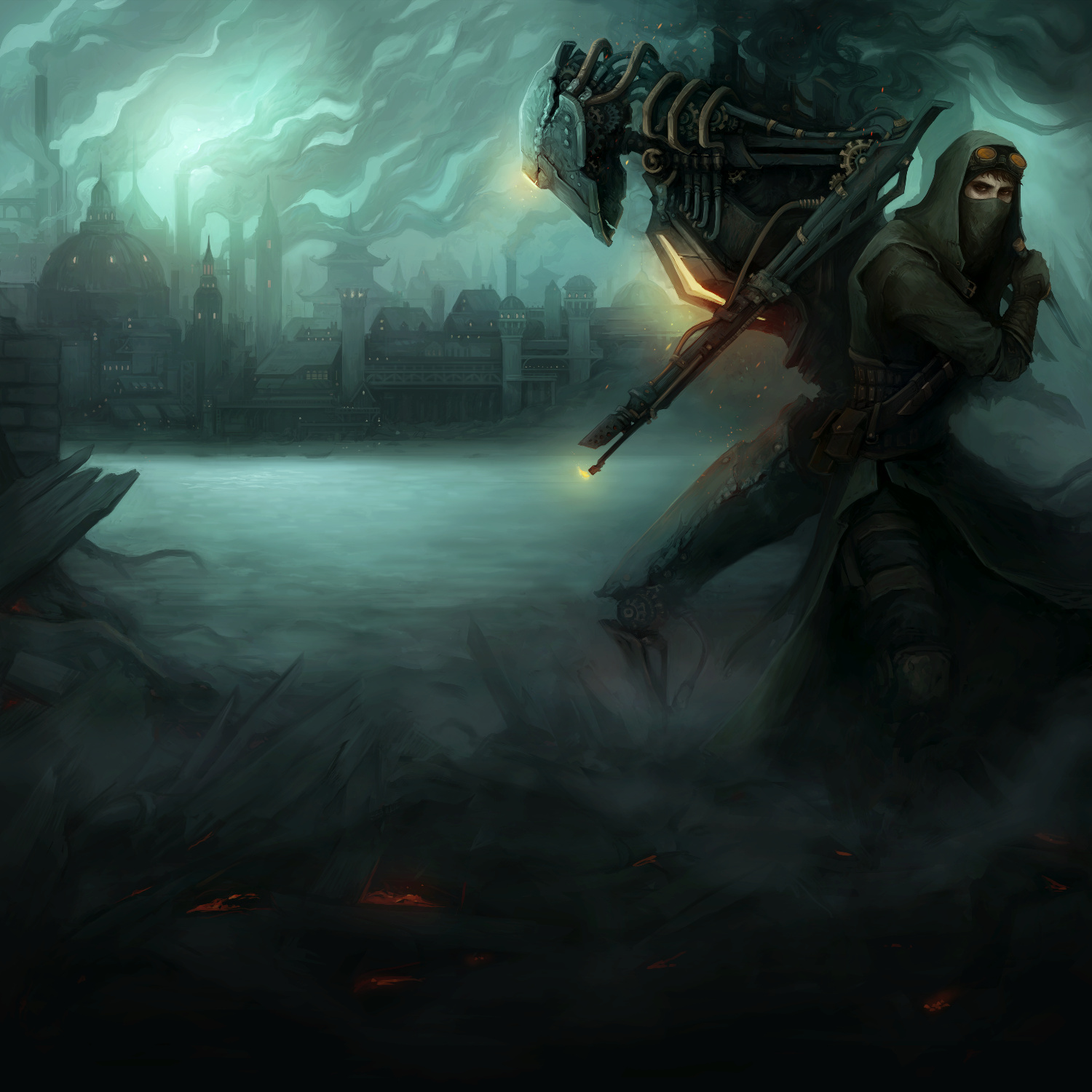
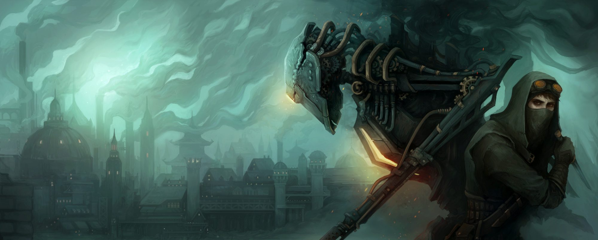
Steamhounds is a multiplayer turn-based strategy game. You will take control of a team of steampunk mercenaries, doing the dirty work of the shady factions who fight for control of a once-great industrial city. Put together a team and build up their strength by deploying them on missions, uncovering dark truths about the city and its inhabitants as you do so. Then challenge your friends in competitive team-vs-team battles, or attempt to climb the online leaderboards in ranked matches.
If you’d like to help with playtesting, just jump into our Discord server. Or if you want to stay updated about our progress, follow us on Twitter or sign up for our email newsletter here.
It would be great if you could help share this article!
Tweet it!